
 Almost exactly 20 years ago, while working at Landor Associates San Francisco studio, as a member of the Corporate Brand Identity team, an iconic logo was born. While riding into work on BART one summer morning, I happened to get my latest copy of Adobe Magazine the day before. It was the July/August issue of that magazine and the bulk of the content was based on typography. I recall reading an in-depth interview with a type designer in New York which also included a small tutorial of his tricks of the trade. It made my morning commute brief and interesting. This article really grabbed my attention.
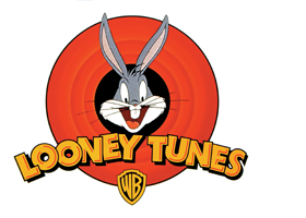
Later that afternoon I was approached by one of the several Creative Directors in the Corporate Identity studio, Margo Zucker, who had a fire she needed help with. This was a common situation at Landor. She needed to be in L.A. the next morning with logo concepts and they had not even started the project. So, I was asked if I could stick around and help. In trying to talk me into staying late that night she sweetened the pot by agreeing to buy dinner. I readily accepted the request to give her a hand (Landor did not skimp on dinner). I was surprised to learn that the client we were working for was none other than Warner Brothers Studios and even more exciting we were to redesign the Looney Tunes logo. Wow – what an opportunity. So, at about 4pm we were given our assignment and got going. The objectives were simple – designing as many concepts as we could. The only parameter was we have to include Bugs himself and the iconic rings behind him. Being such a fan of Bugs Bunny, the Road Runner, and the ACME Rocket Company I grew up watching the Coyote turn into a dust cloud over and over again. I was very familiar with this mark.
Having just read a very intriguing article on typography this is primarily where I put my focus. I recall having generated about 6 or so solid concepts for Margo that evening. My favorite version was one in which I started with Futura Bold. I felt Futura was a fun font but a timeless font that would not be too trendy thus going out of vogue in 6 months. The technique of adding inner bevels and strokes was based on a trick used by the author of the article I read that morning. And I really liked the outcome. I had a blast designing my contribution.
Somewhere around 9pm I made my way home largely because if I stayed any later I would miss Bart and have to spend the night there. So, I bid Margo farewell, handed her my concepts on a disc and left for home. I never did hear what happened the next day. This was also common at Landor. Being a grunt designer you would often never get the rest of the story. Time marched on and I largely forgot about this experience.
A year went by. During this time I was asked to move to the Seattle area to work in the Seattle Studio servicing primarily Microsoft. One Saturday morning I happened to be in a local Safeway grocery store in Lynwood Washington with my daughter who was about 1 year old at the time. As kids like to do I went to get my daughter who was now glued to the small selection of toys. It was there that I noticed a toy being marketed by Warner Brothers with MY LOGO on it. Bam. This was too cool. I bought that toy to serve as proof that my logo was chosen. The following Monday, as soon as everyone settled into the new work week, I called down to the San Francisco office to formally ask what had happened on that project. It was confirmed that my logo was the one selected, intact, and unaltered from that original design presentation. A few weeks later I was visiting the San Francisco studio for a series of meetings. In between meetings I slipped out and went over to say hello to our staff Photographers. Ironically they were shooting the Looney Tunes logo, etc. for the Landor Portfolio. How fortuitous for me. I was able to grab several slides of this iconic logo for my personal portfolio.
It’s always gratifying when your work is chosen to become an international icon. Since 1995, this logo has made its rounds and has become ubiquitous. What is more cool, when my kids see this logo, they tell their friends – ‘my Dad did that logo.’ I don’t get tired of hearing that.